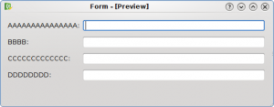
Bad Label Alignment
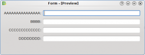
Good Label Alignment
The first UI has a wrong label alignment (KDE 3.x alignment), while the second UI has the right label alignment (KDE 4.x alignment).
HIG on techbase


Bad Label Alignment

Good Label Alignment
The first UI has a wrong label alignment (KDE 3.x alignment), while the second UI has the right label alignment (KDE 4.x alignment).
HIG on techbase
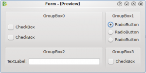
Example of a bad ui layout.
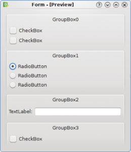
Example of a good ui layout.
The first UI (the bad one) has a complex grid layout which is cluttered and confused, while the second UI has a better layout which looks like a book page that can be read easily from left to right and from top to bottom.
The second UI uses more vertical space, but we must not forget that one of our primary goals is to provide usable UIs.