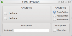
Example of a bad ui layout.

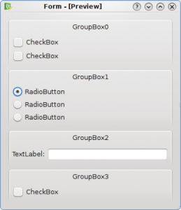
Example of a good ui layout.
The first UI (the bad one) has a complex grid layout which is cluttered and confused, while the second UI has a better layout which looks like a book page that can be read easily from left to right and from top to bottom.
The second UI uses more vertical space, but we must not forget that one of our primary goals is to provide usable UIs.

The second one is completely unusable for Netbooks in many cases – just try using Kontact with 600px vertical space.
Making the form windows scalable could be a solution for that.
> The second one is completely unusable for Netbooks in many cases
The second one can fit a 640×480 display.
@blueget: so your WM should make possible to easily scroll the window (or better the screen) if it’s to llarge, just like any decent smartphone OS does
these days.
Anyway, if you can have a config dialog within 600px and with the good layout, it would be perfect.
What would be useful for netbooks is if people added scrollbars to anything more than 480 pixels high so that I don’t have to alt+drag my way around dialog boxes all the time.
> The second one can fit a 640×480 display.
Yet it’s not wise to generally expand vertically….
The above example may fit but there are many dialogs that will not fit on a 480 pixel height display (i.e. Maemo devices).
So either use dynamic layouts or ensure that it the dialog is scrollable.
There are times when a grid layout fits perfectly, and netbooks are 600px wide, not 640, this 40px do make a diference. also there’s too much horizontal space wasted on the second one, whereas the first uses it imo in a good way.
It’s only speculation.
The best UI grouping depend of the logical grouping of thing joined by logic.
What is the logic ralation of the groubox 0 and 2? And 1 and 3.
in the first mockup thei are close and sugest a logic relationship.
The second sugest a logic order of makei the choices.
If its a categorizaton dialogo the text label shoud be on top.
Speculate patterns of deisgn with mocups it’s only speculation.
@Uninstall: I think the point of blueget is that vertical settings are bad for netbooks, unless they provide scrollbars so you can scroll the contents (like current system settings does).
Otherwise the first would be the better for netbooks because it uses horizontal space in a better way then the second.
I guess user interfaces are a matter of personal taste. Personally, I think the second UI wastes too much space and is (to me) visually unpleasant. That said, I must agree that most people would prefer the second example.
To my mind the blocks are still a bit too much spaced.
You can refer to the articles made by Carsten Lentzsch on UIs (in his case java Swing, but most of principles explained in his papers can translate to other toolkits). :
http://www.jgoodies.com/articles/first%20aid%20for%20swing-75min.pdf
Those kind of UIs totally suck on Netbooks and they never get fixed (Hello all the KDE apps and Gnome apps with those shitty high UIs )
They need to die!
Why don’t u think about people who use netbook?
Vertical layout are the worst thing that can a netbook user have…
Call me crazy, but I hate windows like #2; it’s so sparse. #1, imo, has a good visual information density, as measured by a info-to-pixel ratio. #2 could be resized to a half or maybe a third its width for it not the text input.
I like being able to see everything in the same field of view.
I admit I am probably in the minority though: I also prefer a good thick block of Perl to languages that require one trivial statement per line.
Oh well, the trends are not in my favor…
If you’re going to use book analogy to show why the first design is bad, I could also use a newspaper (or magazine) analogy to show why the first design is acceptable.
> > The second one is completely unusable for Netbooks in many cases
> The second one can fit a 640×480 display.
Depends on the font size you are using of course. However I assume that on a Netbook you’d intentionally use a font that is not bigger than the default anyways.
The first screenshot also has got a Netbook issue involved:
Once you switch to a verbose language like french then chances are quite high that the first dialog will exceed the space that is available horizontally.
Anyways, the second screenshot is the version that looks less cluttered. Personally I’m also in favour of reducing/restricting the amount of group boxes to three group boxes per page to make the whole dialog easier on the eyes.
Thank you for working on KDE usability. All those funky Ktechnologies are great but in the end only usable GUI matters 😉
The first example is only cluttered because the text box is too wide.
I don’t know, I think it’s dangerous to be basing blanket usability statements on prototypes which contain great labels like “GroupBox3.” Usability metaphors should be consistent, but the way in which those metaphors are laid out and used needs to be circumstantial.
I would say that both of those examples are equally good/bad, depending on the context. It depends entirely on what’s in those boxes. Without context it is impossible to say which one is the better one.
And how the user interpretes the layout matters too for that matter. For example, say those windows were used to configure an app. Some users could very well think that the top-to-bottom approach (example 2) implies an order of importance that the UI designer did not intend.
The common tendency to use second type of layout is what makes KDE and Gnome hardly usable on netbooks with small screens. I hate that constant alt-dragging which I have to do very often.
The second UI is just an example which is not meant to be the solution to all our problems but it’s a good enchancement. Moving groups to different tabs might be a good solution in some situations…
Anyway we don’t plan to make KDE unusable on netbooks but we are working to provide a good shell (plasma-netbook) also on netbooks.
I would tell #2 is BAD UI.
Frankly we cant say what interface bad or good without knowledge of logical model.
in #2 may happen that users should type text first and only after to check box in the bottom.
so all of it just speculation.
Concerning concept.. why not you have label fields on pane? It would be nice if user can see comment of process.
thx
Is there anyone with GUI designing training or knowledge around ? With proper training ? Are those dialogs examples taken from any HIG ? Or are they going to be in KDE4 HIG ?
it could be great if complex dialog box area could be collapsed when they don’t fit on screen. Each area should have an explicit label and expand on click or on hover. Of course it’s not perfect for discoverability but IMO it’s still better than scrollbars (it’s a pain to scroll on a netbook).
Of course, this behavior should be activated only when the screen resolution is too small and good descriptive area on each collapsed block should be provided.
This is completely undecidable if you don’t know what the options mean. Anyway, having seen only the pics, i thought the first is the good one., It looks cleaner, and doesn’t look like someone just put random widgets one after another.
In any case, the meaning of the widgets is important. Having search options far away from the search box is bad, for example.
I agree, your good ui is much more pleasant
As others stated it is also important that window sizes accommodate (un)-usual screen sizes (window just needs to be aware of the screen size and add a scrollbar when necessary. You would expect the window manager to do that job). The folding Ideas mentioned are also good suggestions.
To me the thing that is the biggest usability issue currently (and is not visible in either of the UI’s shown) is the trend to transparency. In both of your examples the background does not interfere with the text that I am trying to use. Your good UI is more pleasing, but if one UI was opaque and the other transparent, my decision would have to be the opaque, no matter how badly it was organized. OK Within limits 🙂
I dont get it.We have widescreens and are building apps that dont fill it.
Why is the example 2 a good design if it doesnt use the full screen?
@Uninstall:
As most comments note, good / bad, depends on the context and logic of the application. The second UI is just another option – it need not be a “good enhancement” at all!
To me the compact nature of the first UI is more appealing than the sprawling length of the second.
Honestly I’ve nothing to say except that saving space and filling every empty pixel with a widget doesn’t increase the usability.
Anyway, please, don’t forget that a good logic with a bad layout can’t be really usable…
Pingback: elumamid