Useless clutter

Less clutter
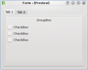
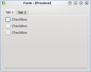
The groupbox in the first UI is completely useless and it only adds more clutter for free, so it has been removed in the second UI. What we get is a less cluttered UI and every widget is grouped by the tabwidget.


Useless clutter

Less clutter
The groupbox in the first UI is completely useless and it only adds more clutter for free, so it has been removed in the second UI. What we get is a less cluttered UI and every widget is grouped by the tabwidget.
Hi Davide, really nice posts!
But I would like to hear more about tab usability, I have a highly complex tab in tab dialog and don’t know how so simplify it. Maybe there is a general rule that I just overlooked, I just know that it can’t stay like this 🙂
Actually, for me it’s still unusable because of the 2 lines , the first from the dialog and the second by the tab widget.
http://tinyurl.com/3cu3zw feels a bit better because it doesn’t get of the widget, but feels inside of it.
Keep those posts coming 🙂 I like them a lot, i’ve learned sth from previous ones ;]
I have to agree w/ tomaz, the example he (?) provided has a better separation of elements as well as providing better clues to what funcyion has actually been selected.
The contrast between the 2 tabs in your (Davide’s) example is not enough to show me instantly which tab I am working with. It even takes a person w/ limited eyesight a moment to recognize that the 2 tabs are separate elements.
Also (I don’t know if this is due to the image or some other variable) the fonts in tomaz’s example stand out clearly and are easily readable. The fonts in your (Davide’s) examples are not as sharp and crisp, causing further effort from the user.
Davide, I really appreciate the effort you are making to help people think about usability as a key part of the interface
Obviously you are working with Ideas that are tied closely to the “Oxygen” look, (Which I think is quite pretty) but if usability is to be improved then the basic ideas behind the interface also need to be explored.
Thanks
Another thing (don’t get me wrong, I like tabs),
I noticed that the selected tab is highlighted as I would expect, but that highlighting fades into the background color of the “Working” (Group Box) area. I would normally conclude that the highlighted tab is not really associated with the options in the lower part of the frame.
The second, “Less clutter” example also “feels” more crowded to me since all of the radio buttons have moved up and left a large unused space below.
All in all the only thing I like more about the second “Less Clutter” example is the removal of the title. I assume this title would actually appear in the tabs name. Which leads to the issue of tab size.
See ya
The use of group-boxes is my most hate UI “feature” in KDE. Useless borders around everything – so annoying.
I agree that the example posted by tomaz is much clearer although it’s an issue for the widget style implementation rather than the application interface design.
Also I have to say I think I agree with dherman. Although I see the point I actually think I can read and interpret the second screen shot more quickly. It is probably the case though that the uglyness of the second screenshot should be solved by the widget theme, not by the application UI inserting a groupbox where there are no groups to separate.
While your second screen shot remove the nested border, it also removes the group with its header altogether. QGroupBox is not only about visualizing groups, but also an accessibility feature. An application programmer should not work around the visualization made by the style.
On the other hand, Qt’s QGroupBox offers a “flat” mode, with the borders removed. With Skulpture, for example, both modes look identical.
IMO this example fails again. The first thing to remove here is a tab widget but not the groupbox. Better option here would be to have two groupboxes and no tabs at all. And second thing is that you will probably add more options (widgets) on this tab, and then you will still need to add the groupbox, so why not have it from beginning?