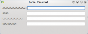
Bad Label Alignment

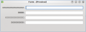
Good Label Alignment
The first UI has a wrong label alignment (KDE 3.x alignment), while the second UI has the right label alignment (KDE 4.x alignment).
HIG on techbase


Bad Label Alignment

Good Label Alignment
The first UI has a wrong label alignment (KDE 3.x alignment), while the second UI has the right label alignment (KDE 4.x alignment).
HIG on techbase
Hi Davide, I really love this kind of posts about usability. Keep going 🙂
Thanks for you work on improving and documenting good layouts.
If you use the Qt 4.4 QFormLayout, you do not need to specify the label alignment into the source code or .ui Designer file, it will automatically conform to the guidelines of the platform.
For “native” KDE (all KStyles, for example Oxygen), this will be as in the second screenshot, while on other platforms (e.g. Windows, Symbian, whatever) it might be as in the first one.
Due to a bug in Qt, vertical alignment looks a bit odd with Oxygen right now, but it is still a good idea to use QFormLayout, as it has many other advantages.
I hope in the next post you write about the “field growth” policy. I hate dialogs, where the spin controls are at the extreme right, just because the author decides to stretch them to the full window width. There is also a KDE HIG policy about this, but it is best to simply let QFormLayout decide about this one, too.
Yes. It’s right
The correct way to do this is with QFormLayout:
http://doc.trolltech.com/4.5/qformlayout.html
This places the labels correctly depending on what OS you are on.
Yep, please keep these posts coming! It’s very interesting!
Usability team should categorize usability bugs in b.k.o like this one:
https://bugs.kde.org/show_bug.cgi?id=181967
I think they’re easy to fix and could be assigned as Junior Jobs.
The same is probably valid for tooltips, but how does one go about the aligning there?